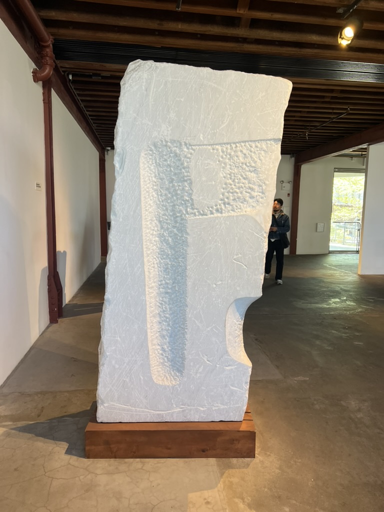
Cabinets of Wonder — Professor Emily Conrad
Field Expedition: Noguchi Museum
Art and Design Museum
Initially I had planned to go to the Whitney Biennial. I went and it was fine. Free Friday is a horrible way to see the museum because it's so busy. One of the most annoying parts of the Whitney is navigating between floors, especially with the administrative offices splitting up the exhibition space. I found it difficult to move around and even more trouble trying to figure out where exactly the stairs were. I was in a rush, and barely had time to look at the art.
I thought my field expedition was doomed.
Then I was at Costco — the most beautiful Costco in NYC, Astoria location. I had dropped off my partner's car and was looking to kill an hour and a half. I wandered through Socrates Sculpture Park, and then down the street where I saw Noguchi on the wall of a triangular building. This is my chance. I went inside and paid the $6 student fee to enter.
The staff at the front desk was pleasant and struck up a conversation musing to each other about what Noguchi thought about animation — a conversation inspired by a sticker on my backpack, which they offered to store for me. I left the front office and walked into the first courtyard. Navigationally, the difference with the Whitney was stark. Light in the corner called me to a sculpture, two paths emerged before me split by a wall. I took a second to sketch the space. The air was springtime cool and pleasantly moist.
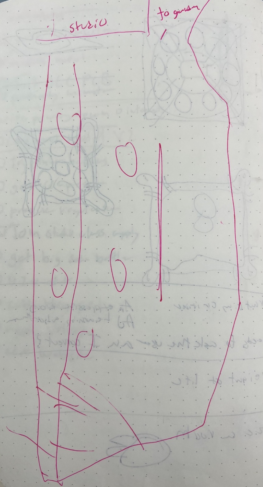
Presented is a non-linear experience where the visitor can move into the garden — an outdoor sunny space — or into the studio. The wall dividing the space makes it feel bigger and provides some direction towards the sunny corner shaded above.
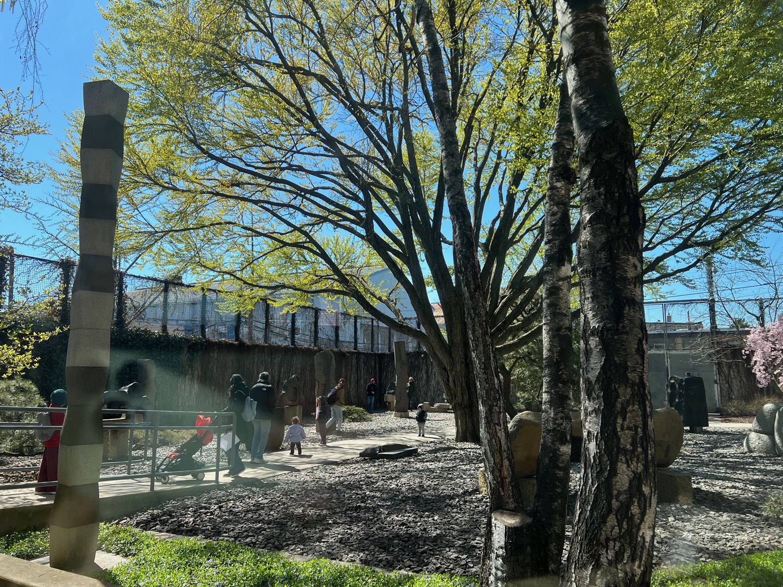
I walked into the garden where I noticed families pushing strollers enjoying the accessibility of the space. The rock garden had a smooth path running through, well graded. Kids ran around on the rocky surface enjoying a closer view of the sculptures.
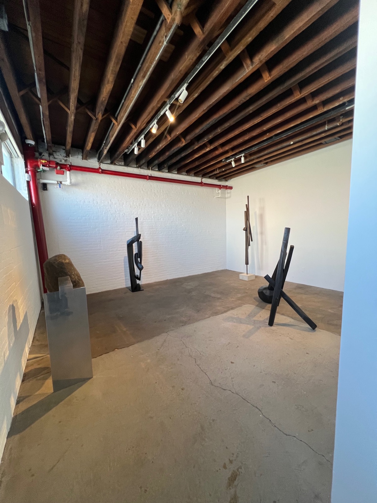
As I moved inside the studio building, I saw tourists walking around and taking photos. The first floor of the studio composed rooms of sculptures grouped by size and theme. I was pleasantly surprised when I ducked into a small room in the back and could hear soft music playing.
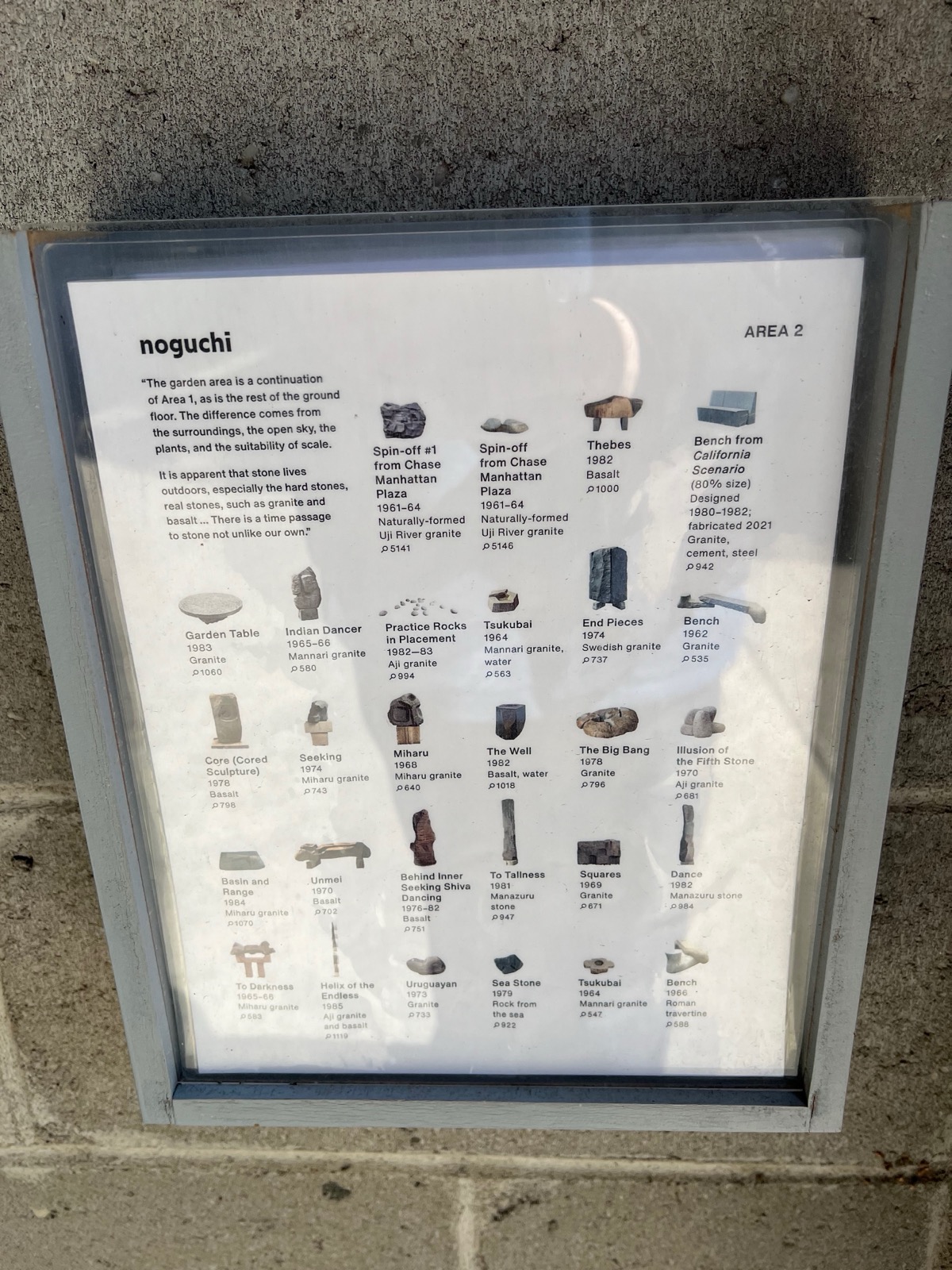
Labeling and naming of the work was unique. Each room had a laminated sheet depicting and cataloging the works in the room. A feature about this which stood out to me was the multiple drop areas for returning the guide sheets. A visitor did not need to return to the entrance to return their sheet and could simply drop it at the far end of the room.
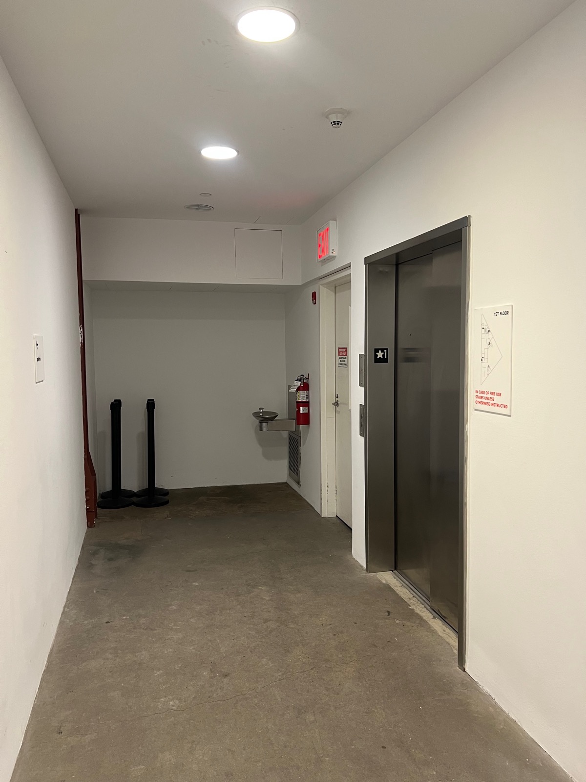
This space was funny to me because the rest of everything was so perfect. This back room contained the elevators, bathrooms, drinking fountain, fire extinguisher — all the ugly stuff. It breaks the illusion developed by the rest of the space.
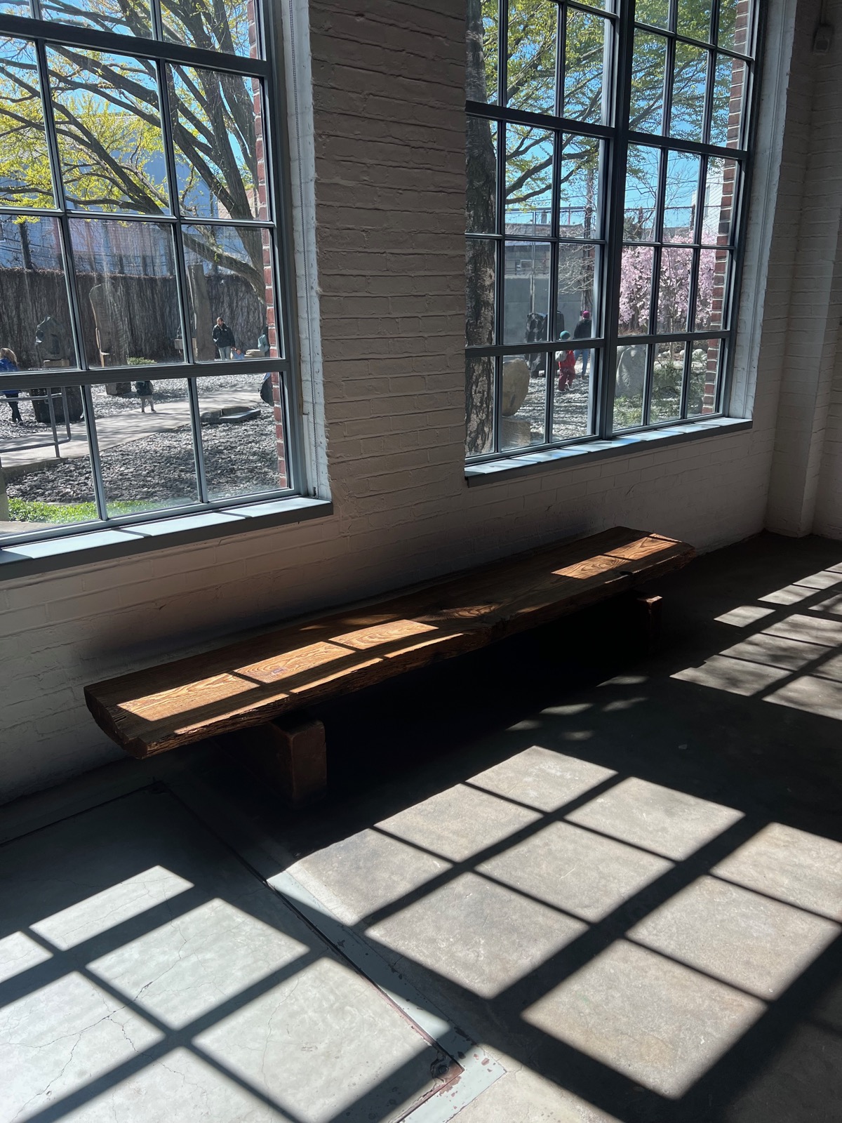
Another room in the studio had this bench which was welcome — it was pleasant that rest was incorporated into the museum's design. The view out the window and the view to the sculptures was pleasant. I think as well, this room had a particular smell to it.
The indoor studio space was divided between downstairs — mostly sculptures — and upstairs which had more interpretive contents. There was an overwhelming amount of content to go through and by the time I went upstairs I struggled to maintain my focus. The interpretive area was a loop so the contents could be encountered either way.
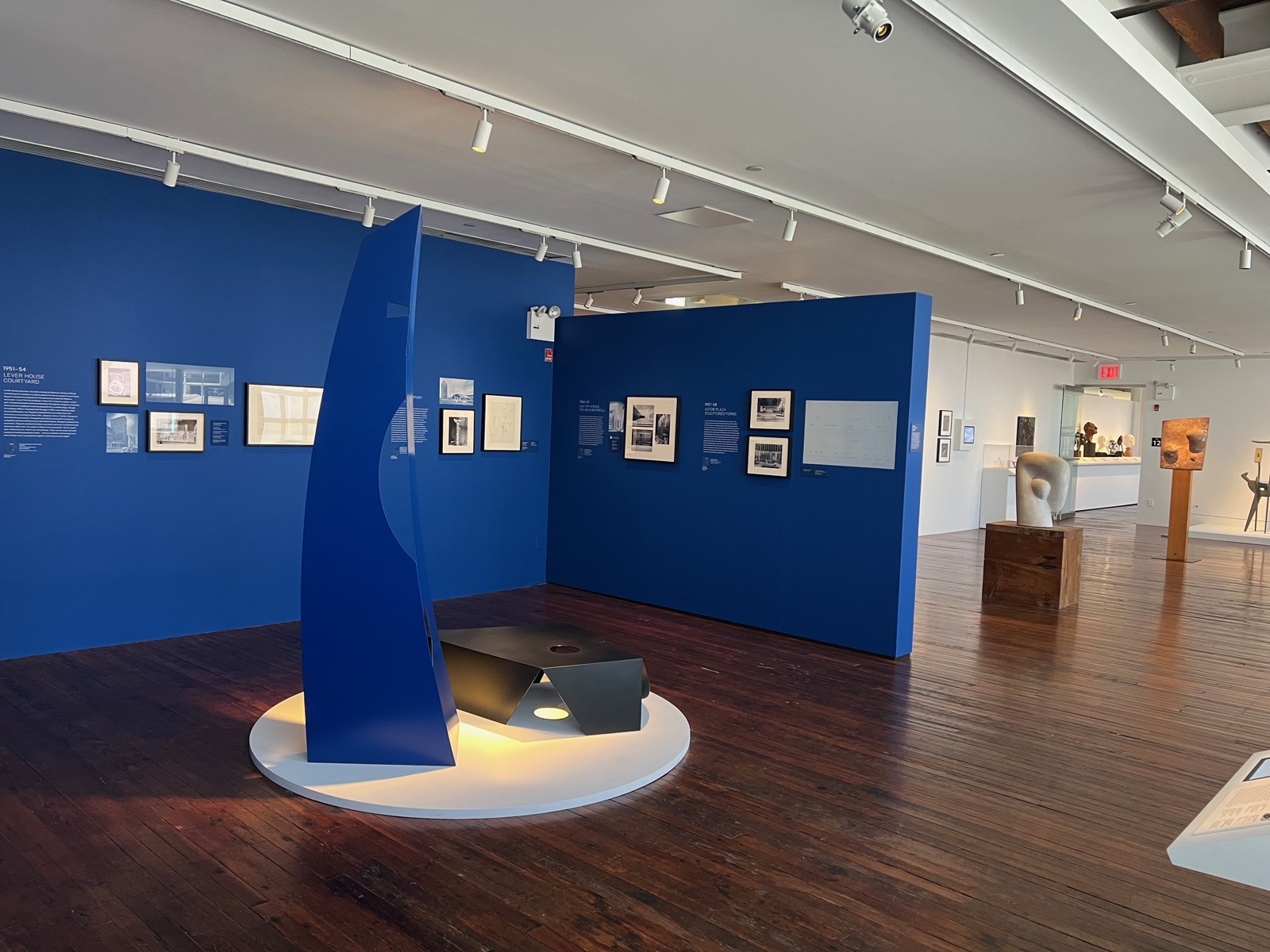
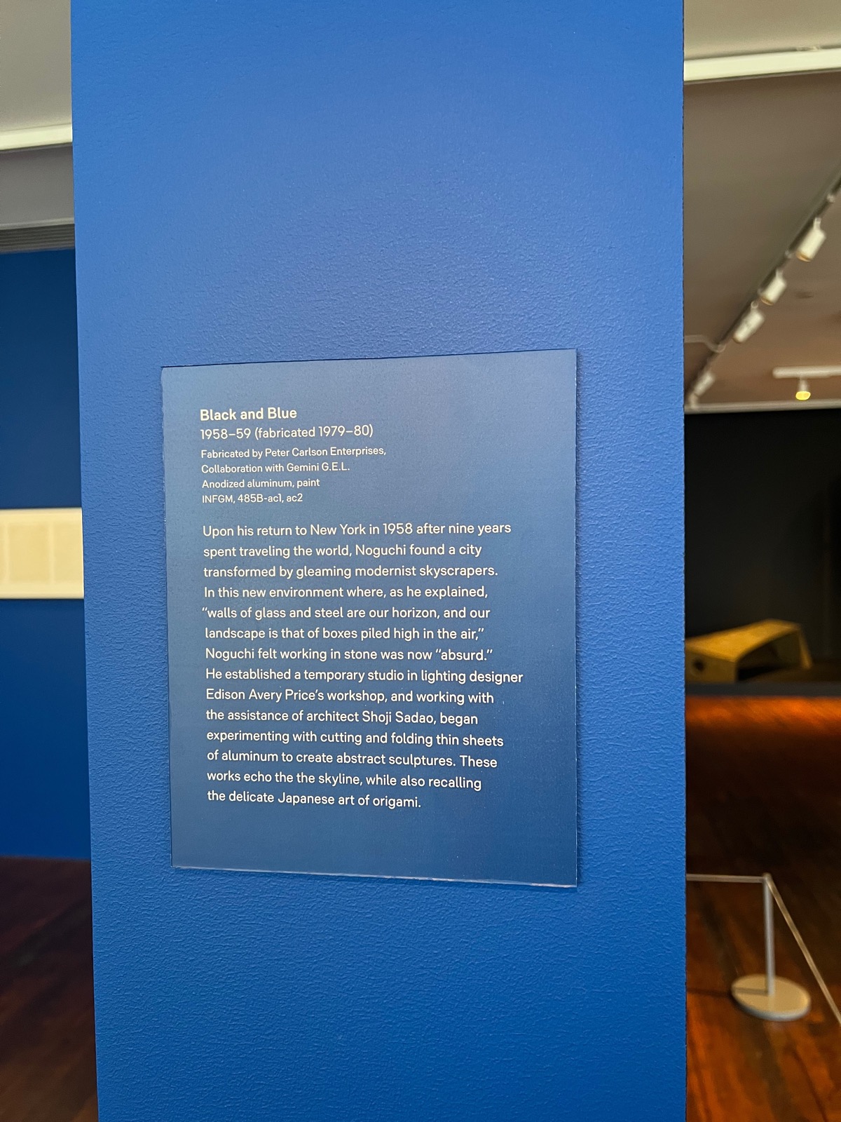
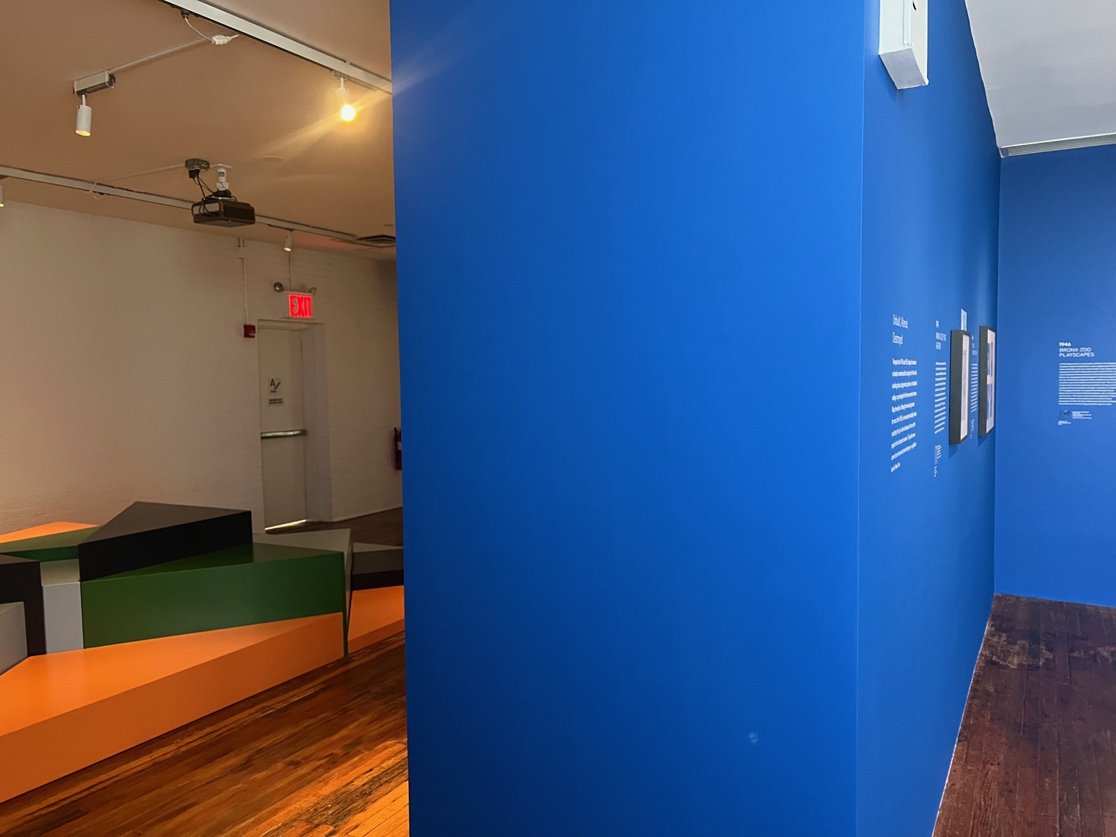
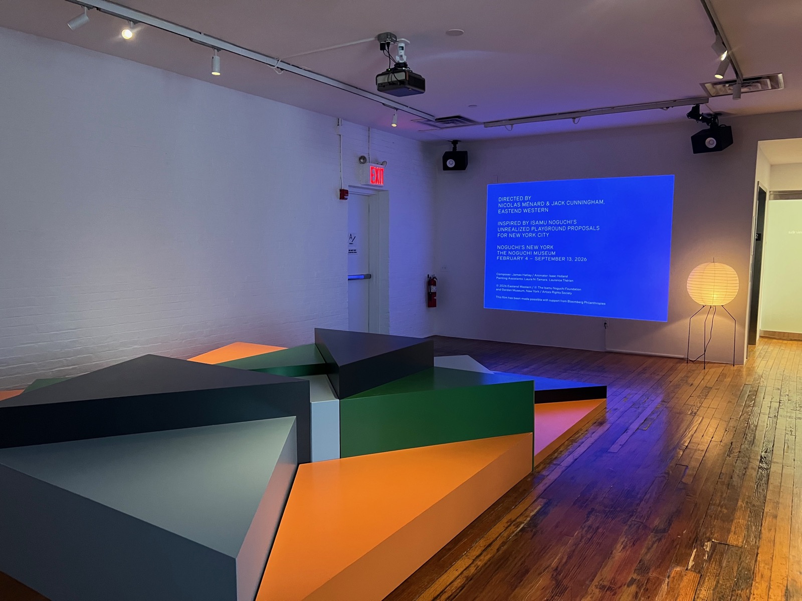
I thought this area was really well done. This blue color grounded the space and continued around the inner wall. The text brought viewers around and into the video space, which was designed in a playful way. I like how visitors are invited to choose their orientation to the screen.
Overall I thought this was the best museum I visited, in terms of visitor experience design, because of the indoor-outdoor split and the diversity of room feelings — between sound and smells. It was a space I could see myself returning to and spending time in. It didn't hurt as well that the art was good.