Cabinets of Wonder — Professor Emily Conrad
The Story of Cosmic Imbalance
created with Shloka Mohanty @ Shloka Mohanty
Shloka and I decided to work together over a shared interest in science museums exhibits. I asked her to come to me with an idea for the concept. She brought the concept of Baryon Asymmetry, a fundamental imbalance in the creation of the universe skewing creating towards matter over anti-matter, existence as we know it.
With that in mind, the question became, how do we communicate the wonder and awe we feel in contemplating this idea with a general audience?
Our initial approach was more of an interactive sculpture centering around a model of the universe on an atomic level which viewers could interact with and scroll through space and time. When we discussed this idea in class, nobody got it.
We moved towards a narrative form, embody both matter an antimatter as characters in a story. Our initial concept of the atomic universe looking glass would be wrapped in a children's book. While Shloka was working on the narrative, I started developing the fabrication and the code.
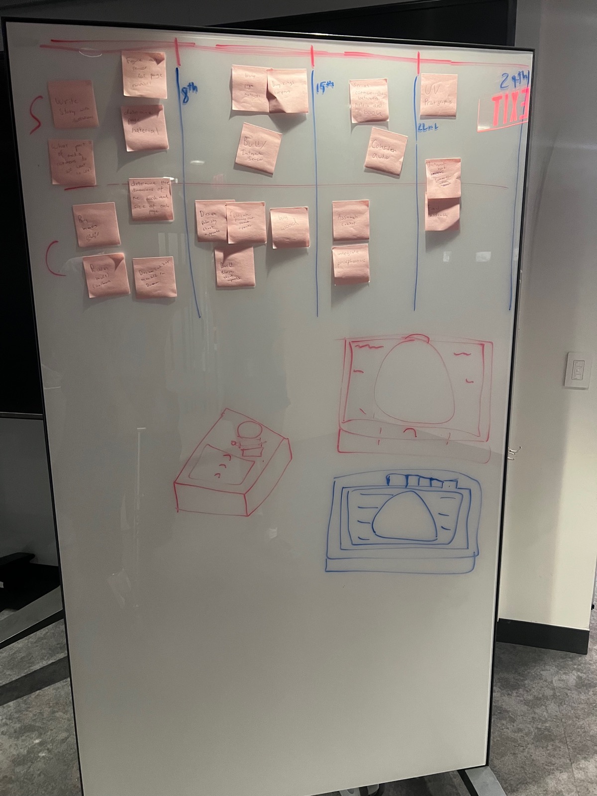
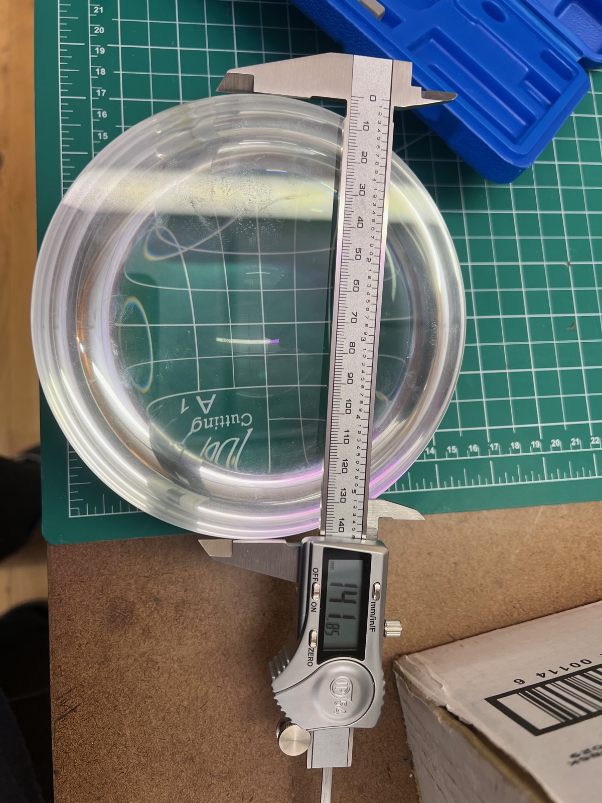
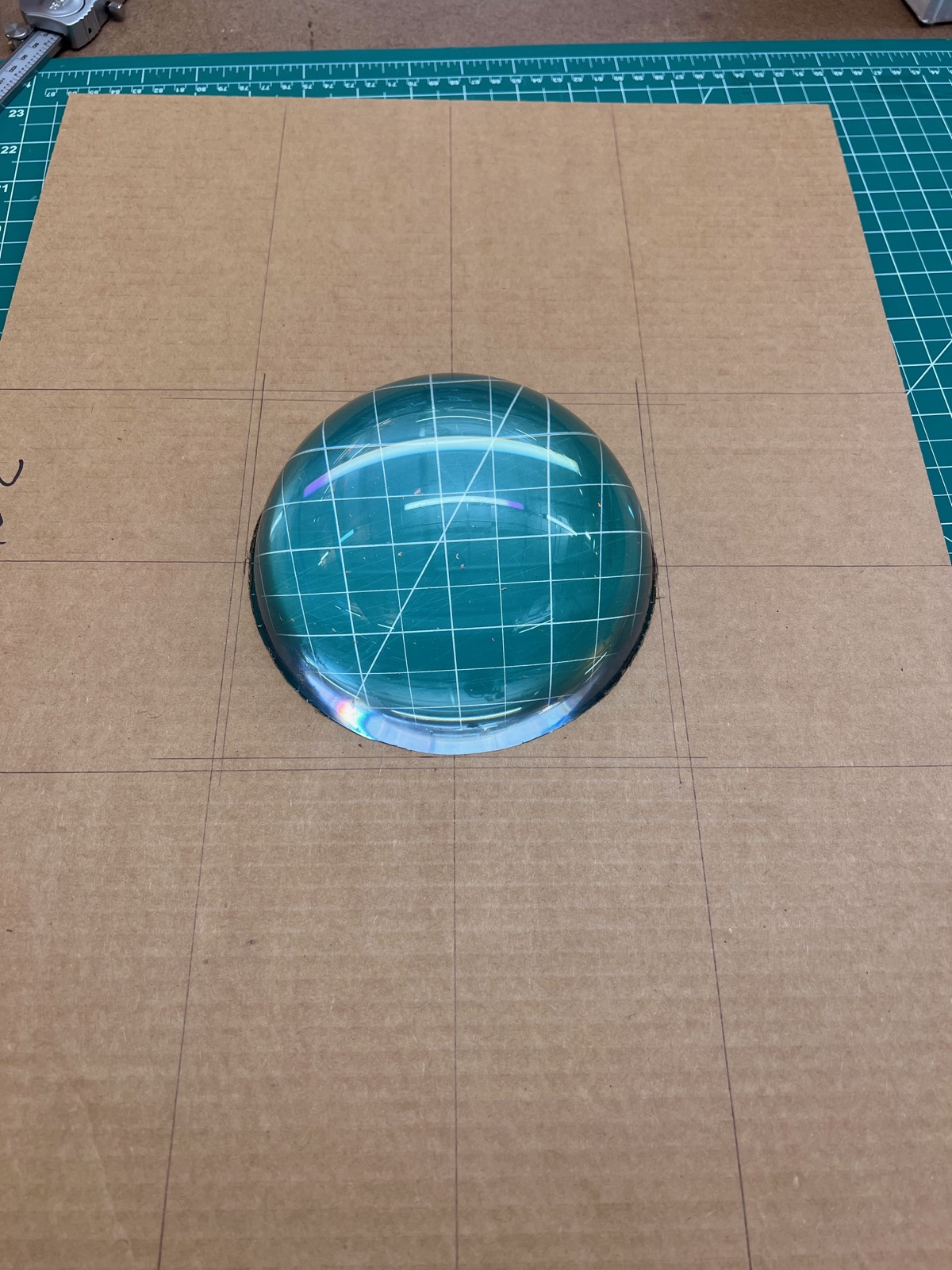
We spent a lot of time trying to find the right medium to play with to discuss subatomic particles. Representing things like this in our level of reality is impossible with physical models, so we decided to use a digital programmable interface. I suggested a neopixel array, as programmable pixels are an ideal interface for motion and control. After that, the challenge became to obscure their presence as much as possible. We designed a stackup including a glass half orb, phosphor sheet, and polarized sheets to dial in a neutral density filter.
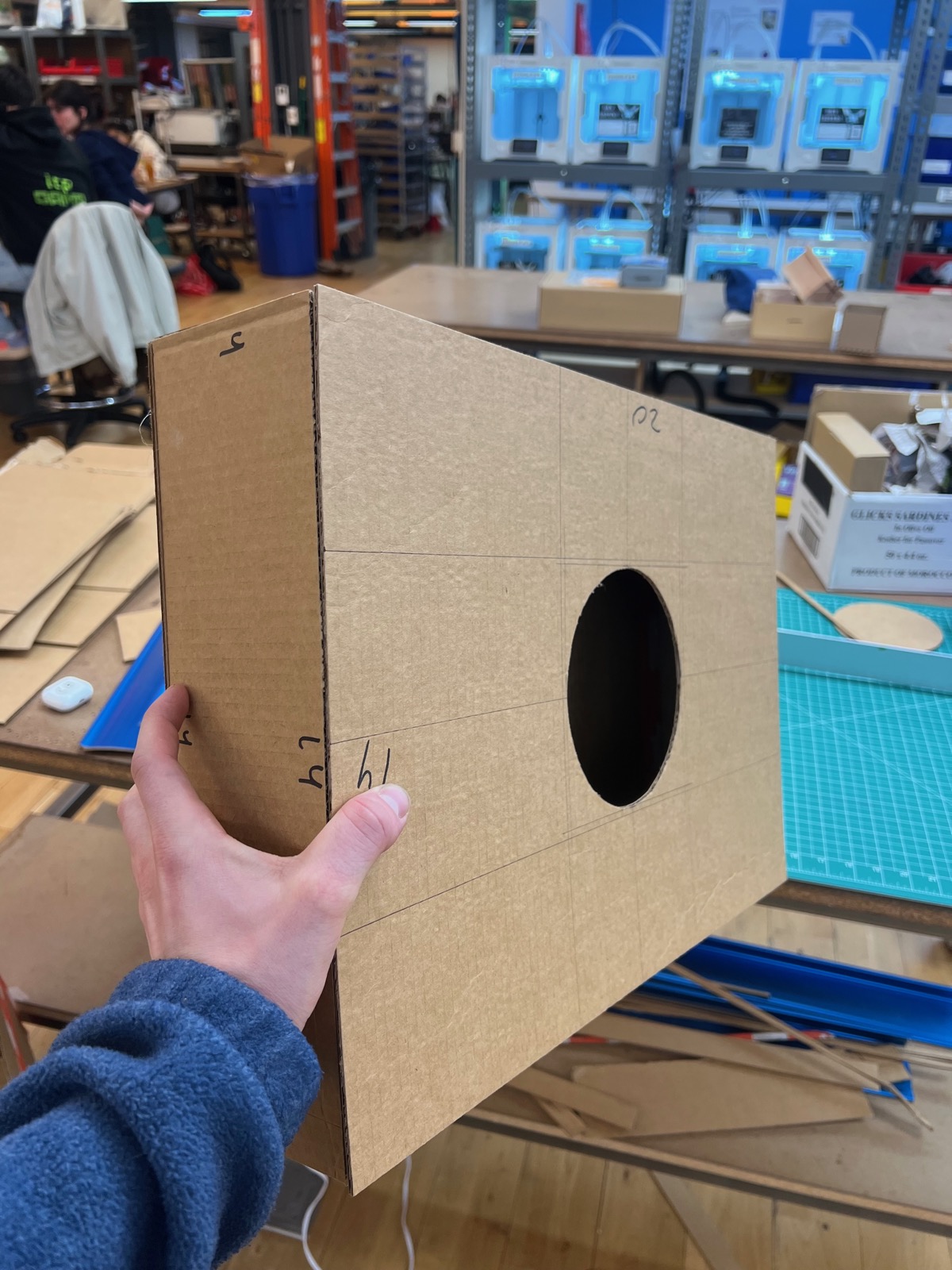
I mocked up a prototype to test the concept. I used cardboard to make a box we could use to house the display and mount book pages on.
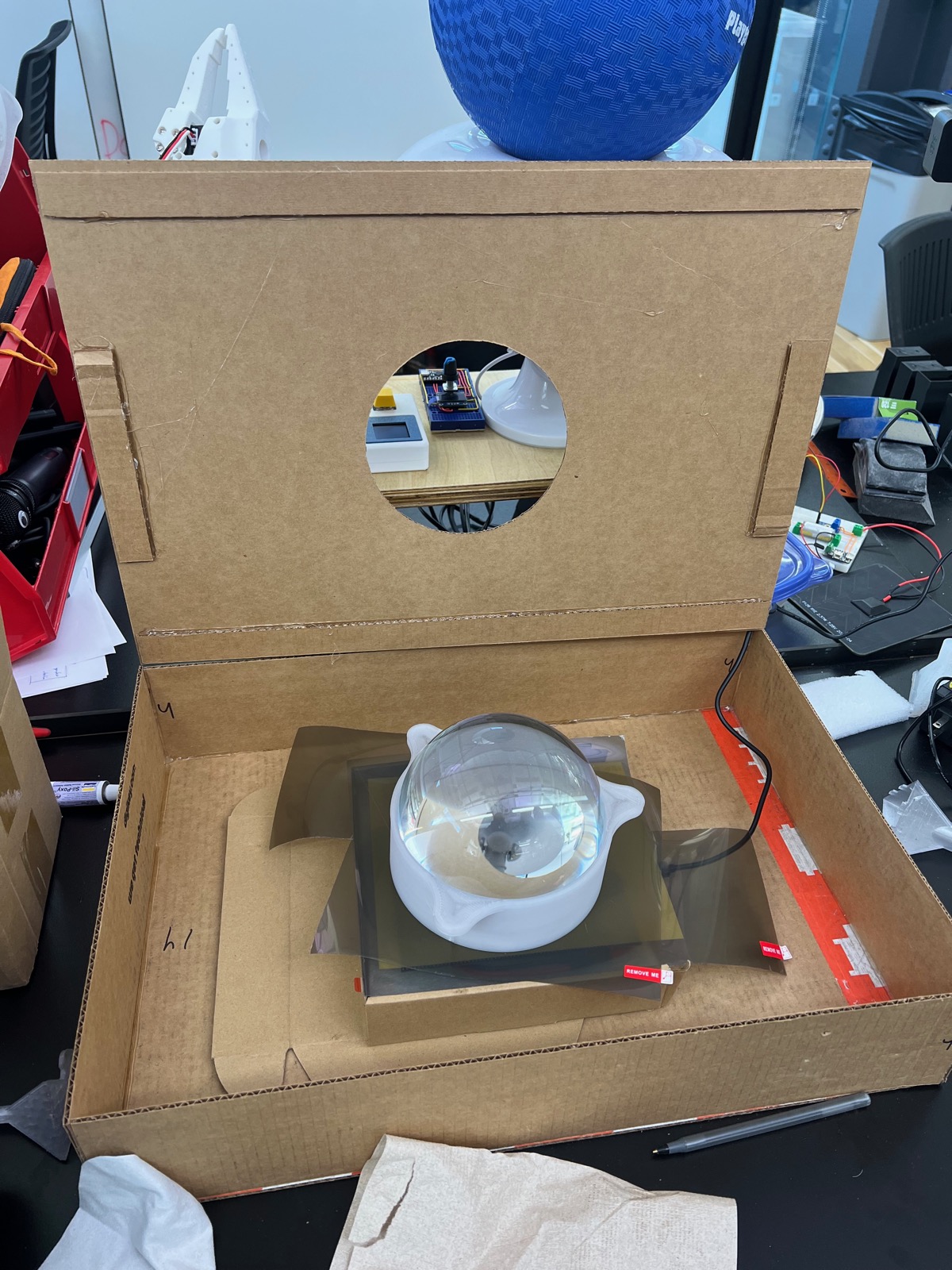
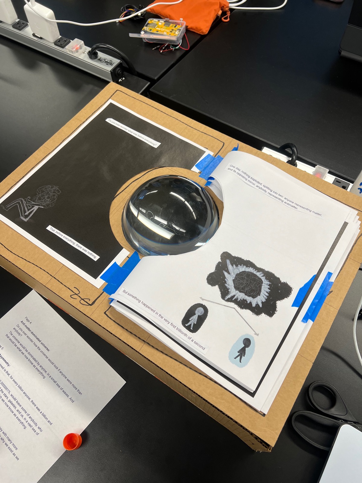
Another layer of visualization complexity Shloka came up with was the use of 2.5mm glass beads. This shifted the geometry of the display from squares to hexagons, further obscuring the visual representation of the pixels. These were carefully placed into a tray which sits on top of the final display layer.
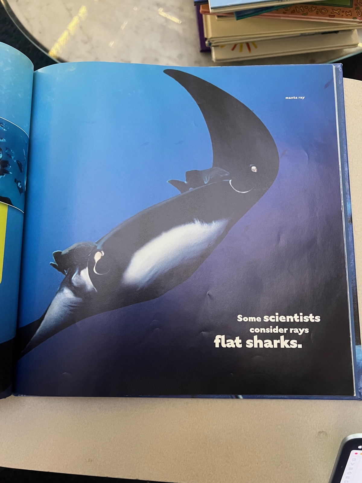
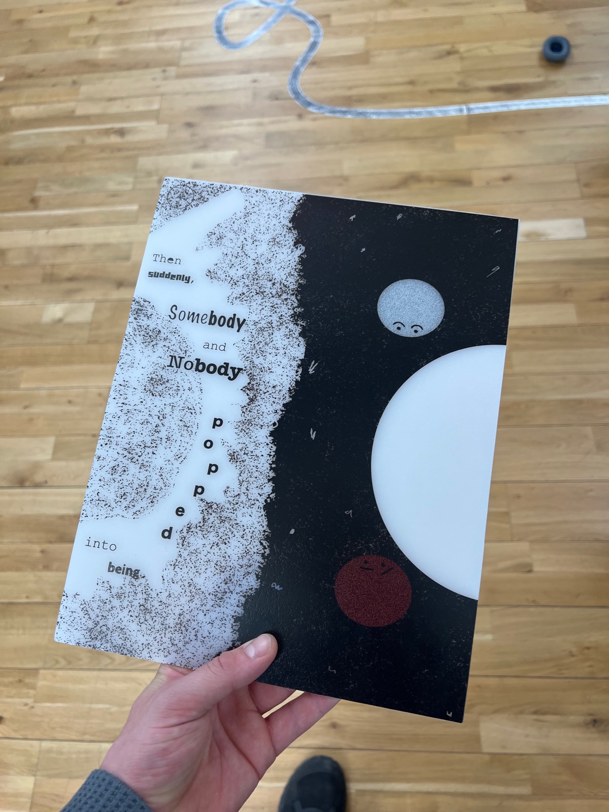
Looping back, it was my turn to get involved with the story. We went to the library to look at children's books and find visual inspiration. Below are some selections of pages we found inspiring. In this period, we rewrote the story about once a week for several weeks to dial in the language and visual cohesion.
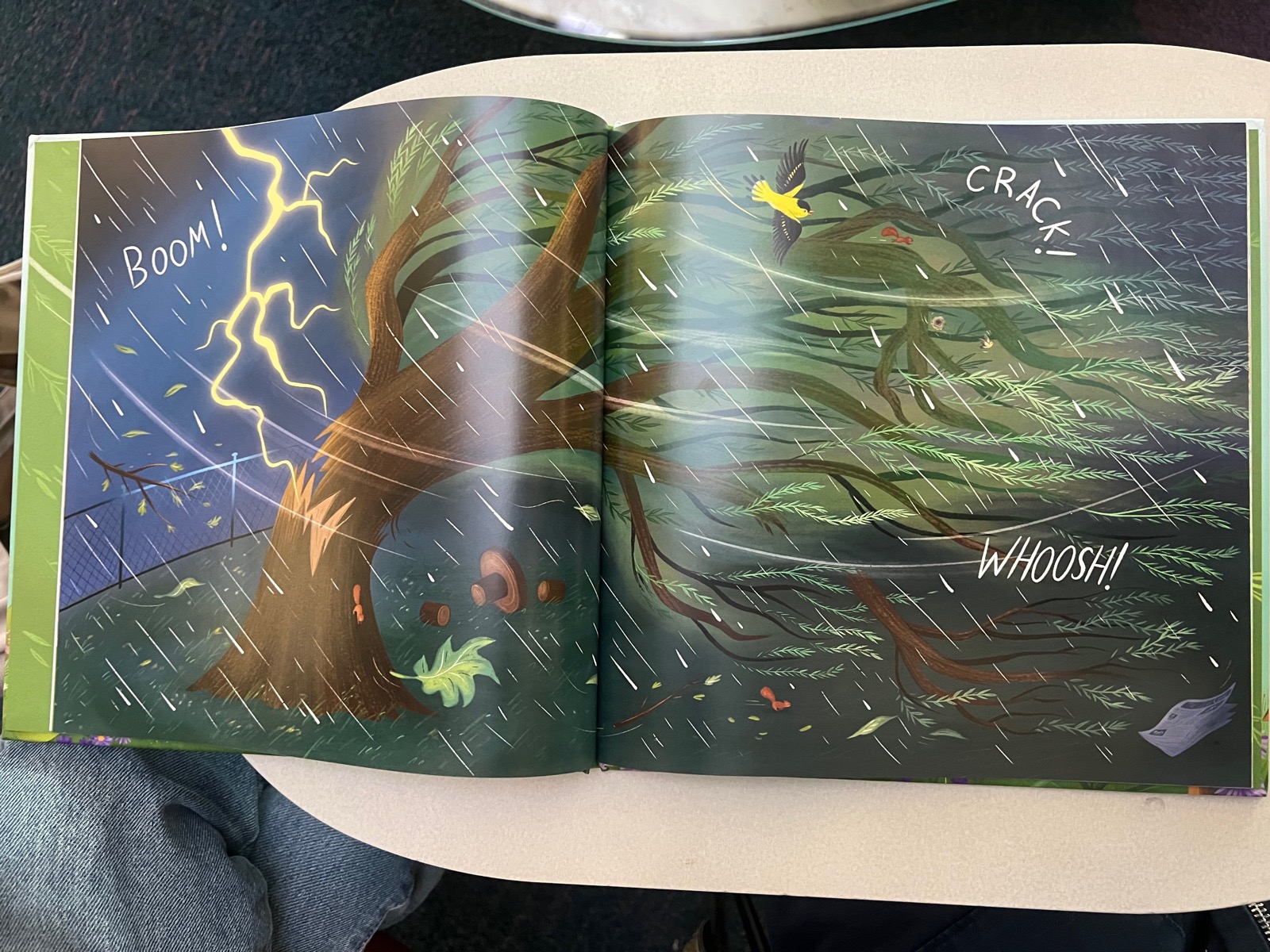
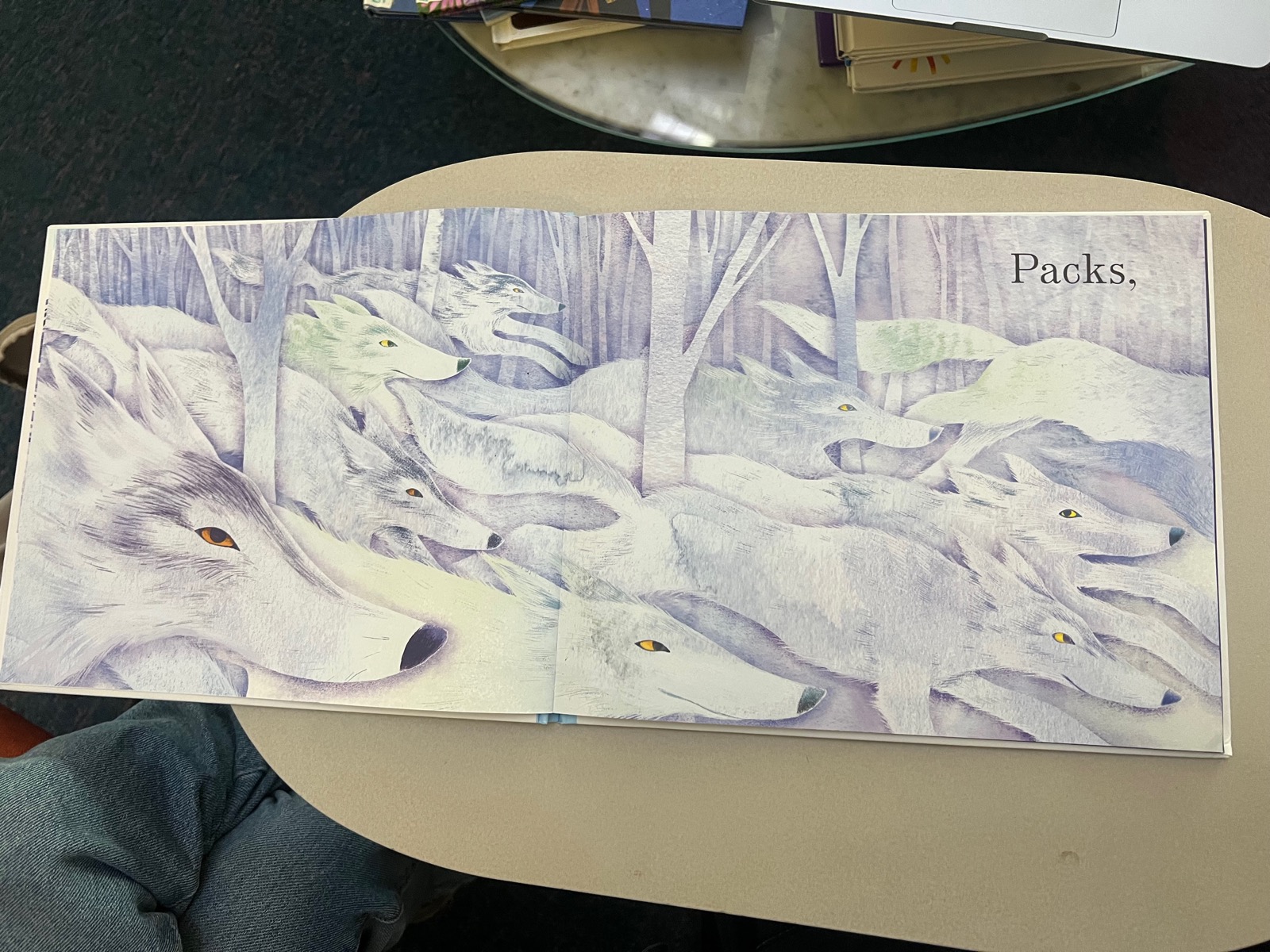
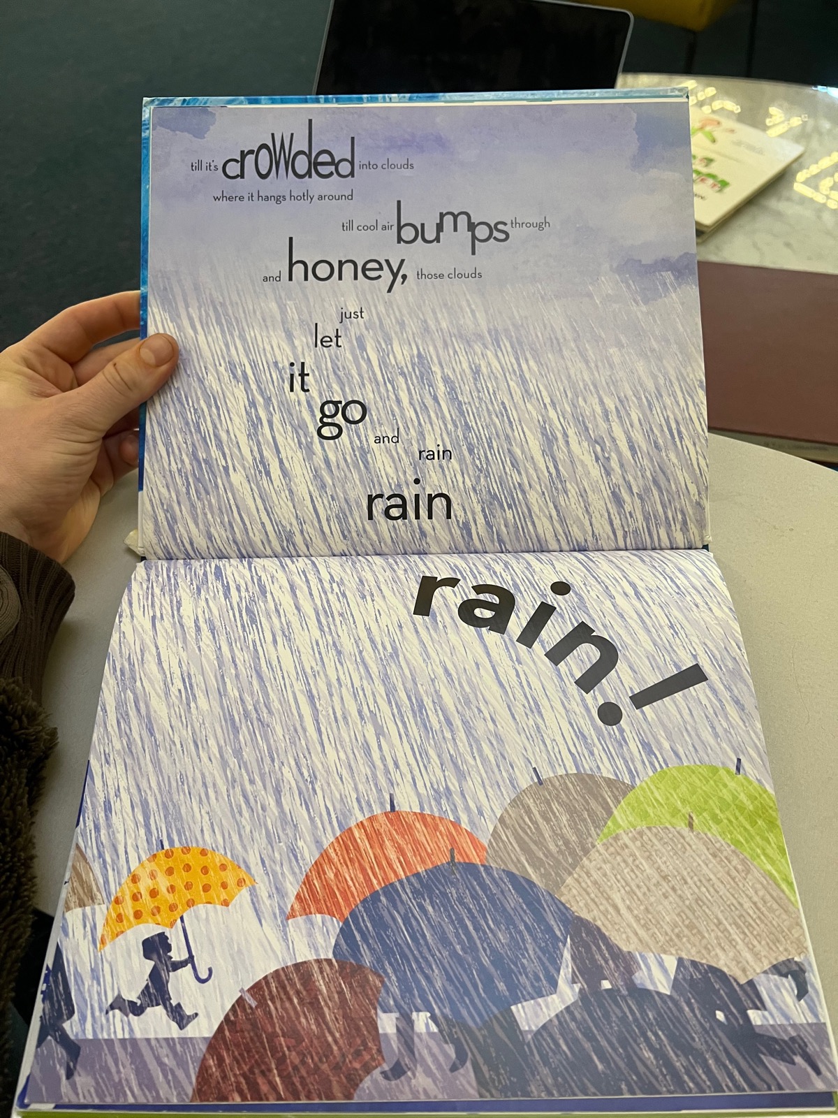
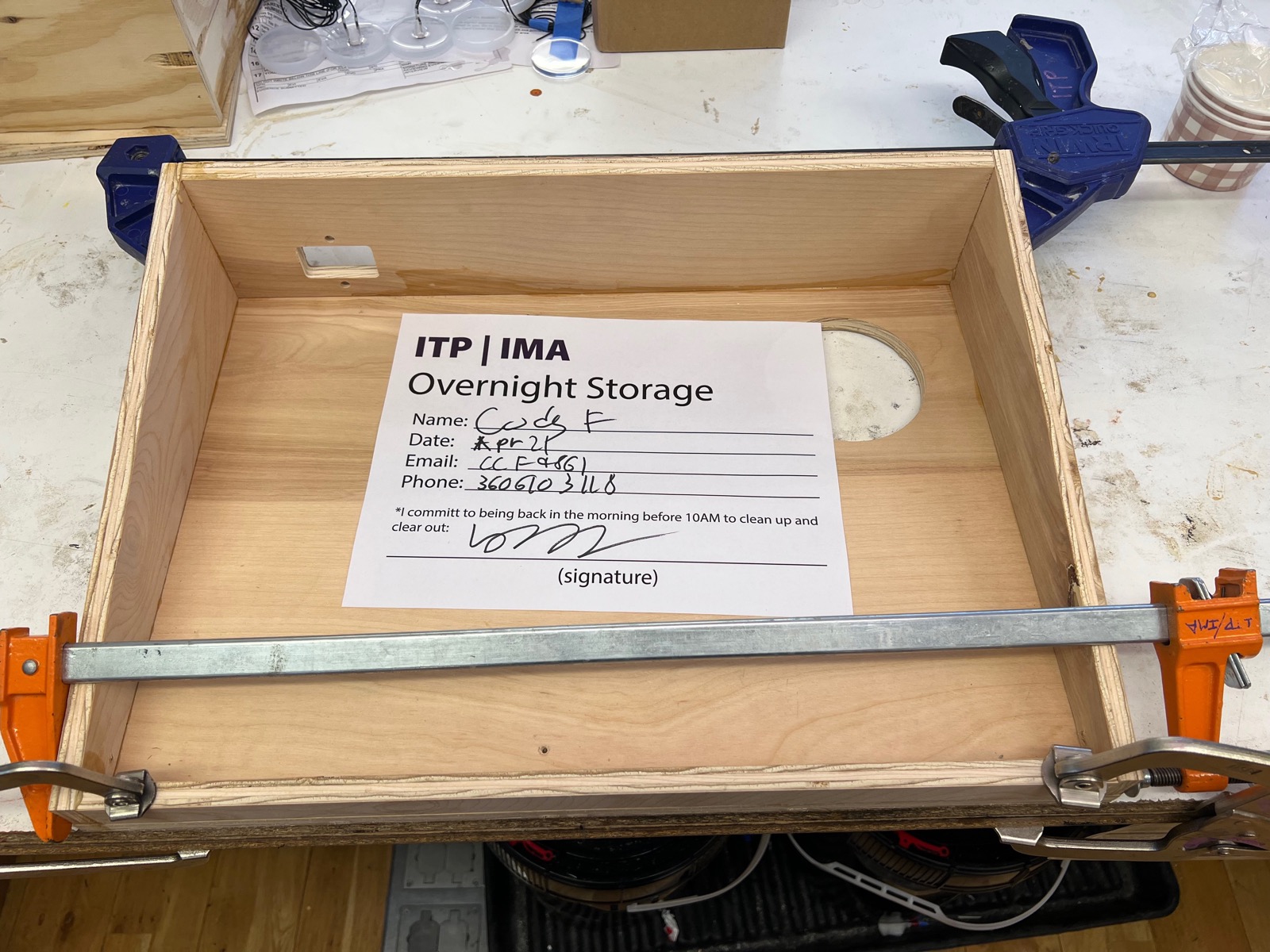
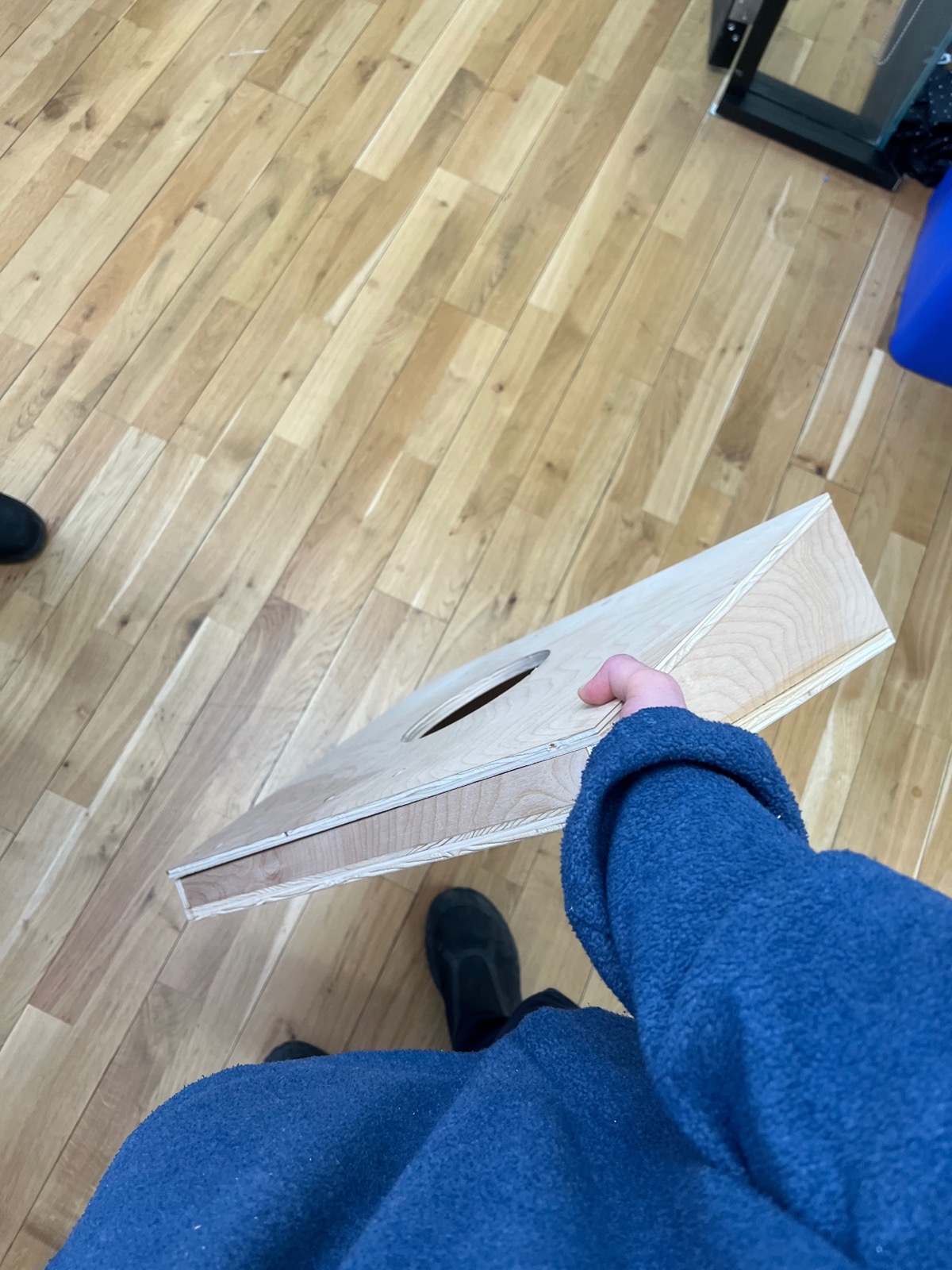
Then, I cut the box out of wood. In our time playing with the cardboard version, I realized that the square shape was not ideal for the users viewing. The orb was best viewed from the top, and so it needed to be tilted towards the viewer. The box would need and angular lid.
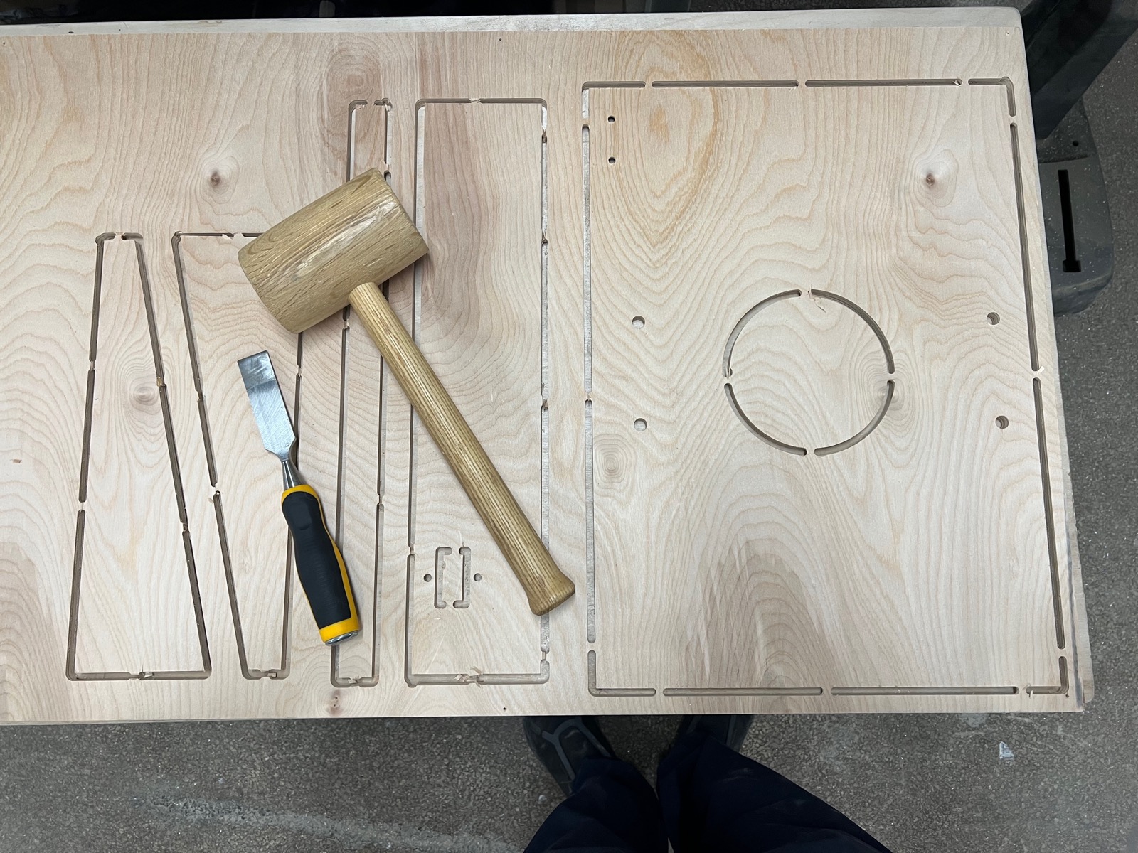
To make the slanted lid, I had the cnc carve into the wood particular angles which I designed in CAD. It was able to make three of the four cuts I needed, the last one I sculpted down by hand with sand paper.
I assembled the base with woodglue. In the end, I cut the lid 3 more times to get it just right, but this part ended up being final.
With the box coming along, we started to think about pages. The material needed to be something tough and museum like. Shloka spec'd HDPE, which was wonderful because its very soft in the hand.
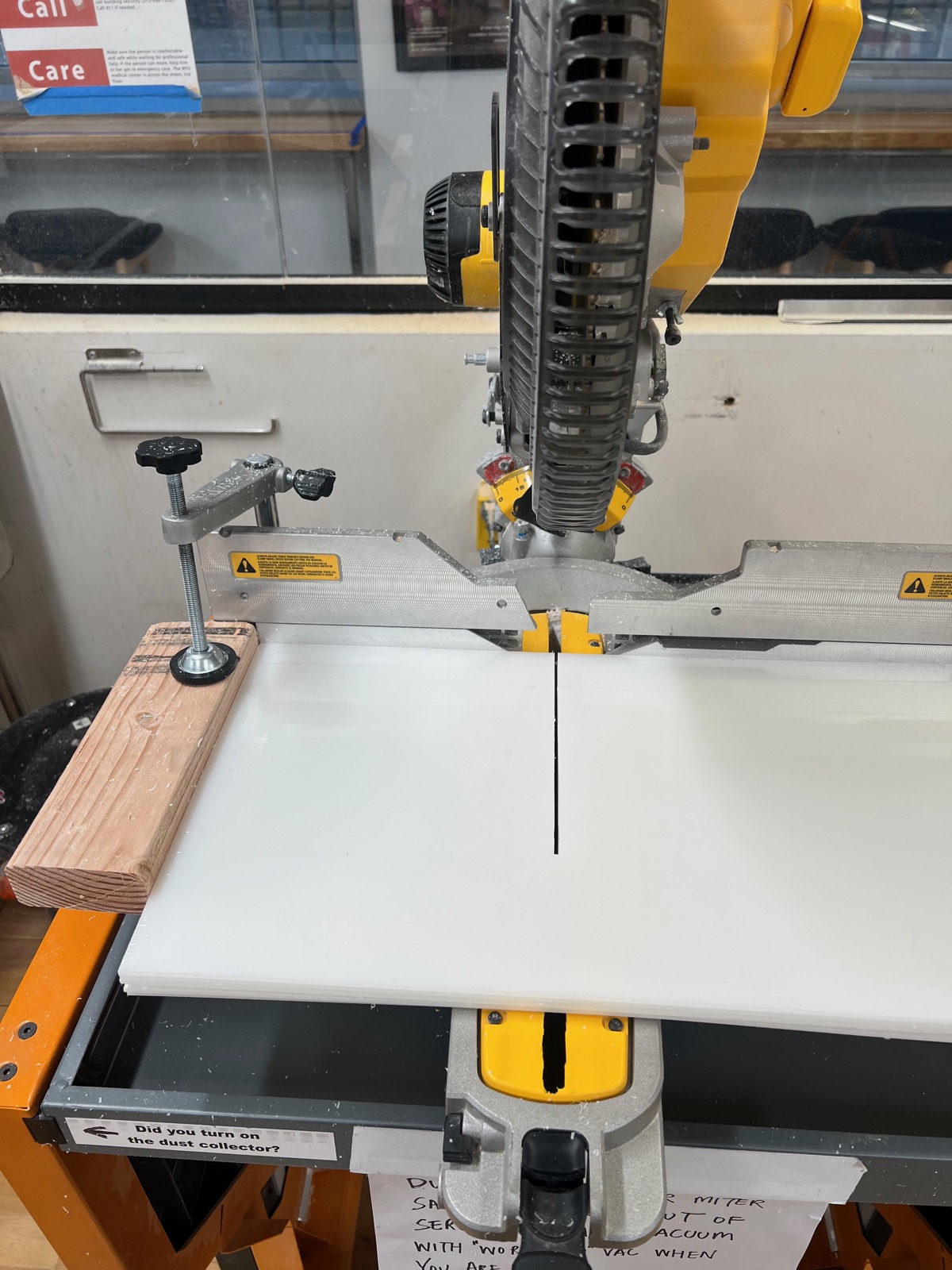
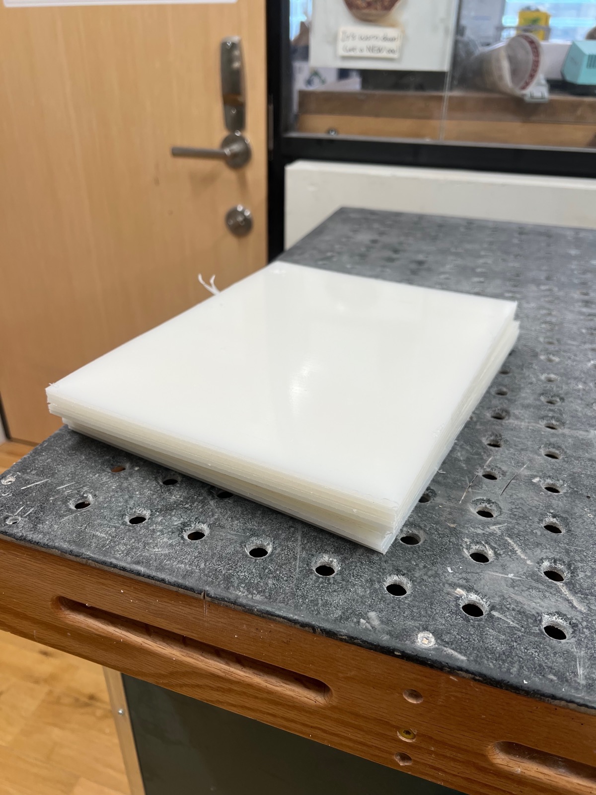
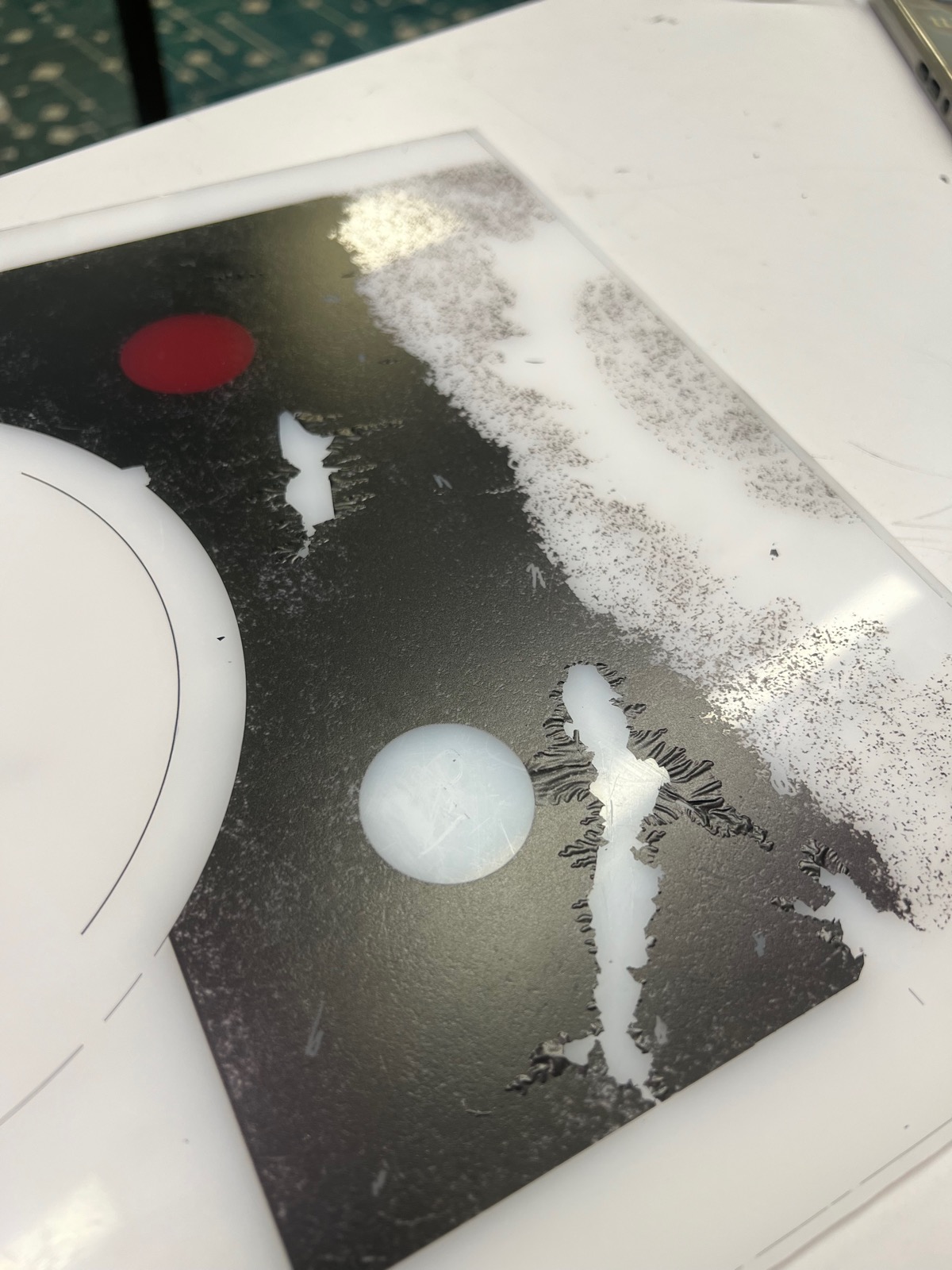
Unfortunately, our initial UV ink test prints did not stick, but after we sanded the HDPE sheets, there was more surface area for the ink to adhere to and we found them to be very tough.
The UV printing was our biggest challenge of the whole project. Just the sheer amount of hours it took on the machine and the lack of support from the department. We were basically unable to print as much as we needed to do braille and textured graphics for our accessibility focus.
Next was electronics. I wired everything up as a squid on the desk and tested the code. Below, I am hand actuating the magnetic sensors we will be using to trigger page turns to display new animations and sound scapes.
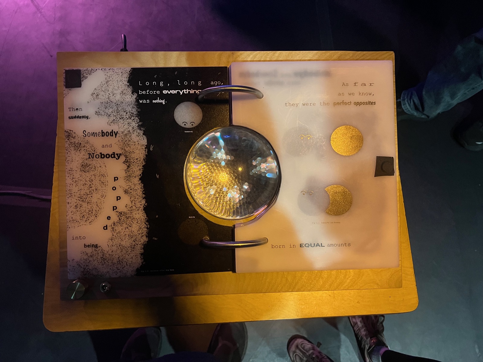
We put it all together for the first showing in the class final. I cant even remember what was wrong with it here, but I felt so defeated. I think it was just missing the sound scapes for each page. Looking back, it was still a great first showing.
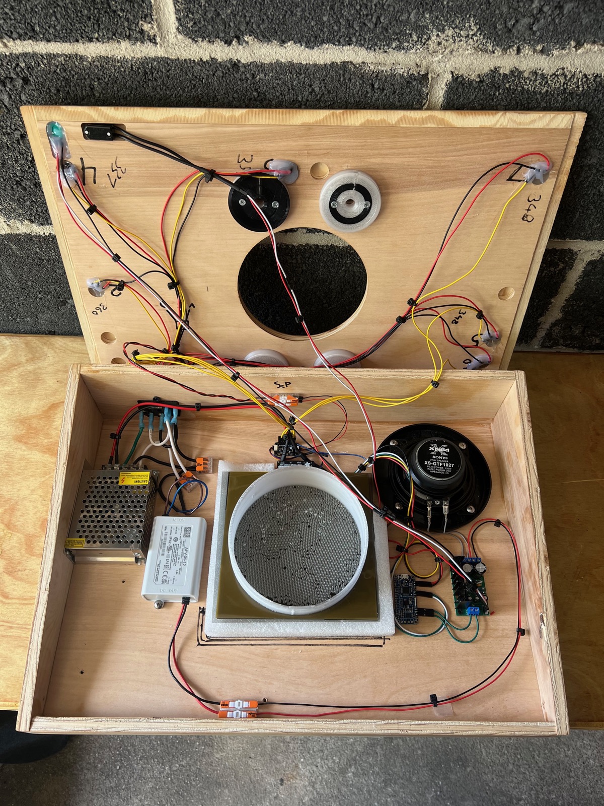
I took it home to rework the wiring so it would fit together a little easier and we could debug it to figure out the sound issue. these shots are a great look at the final wiring.
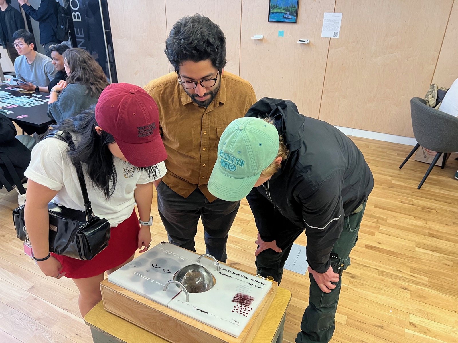
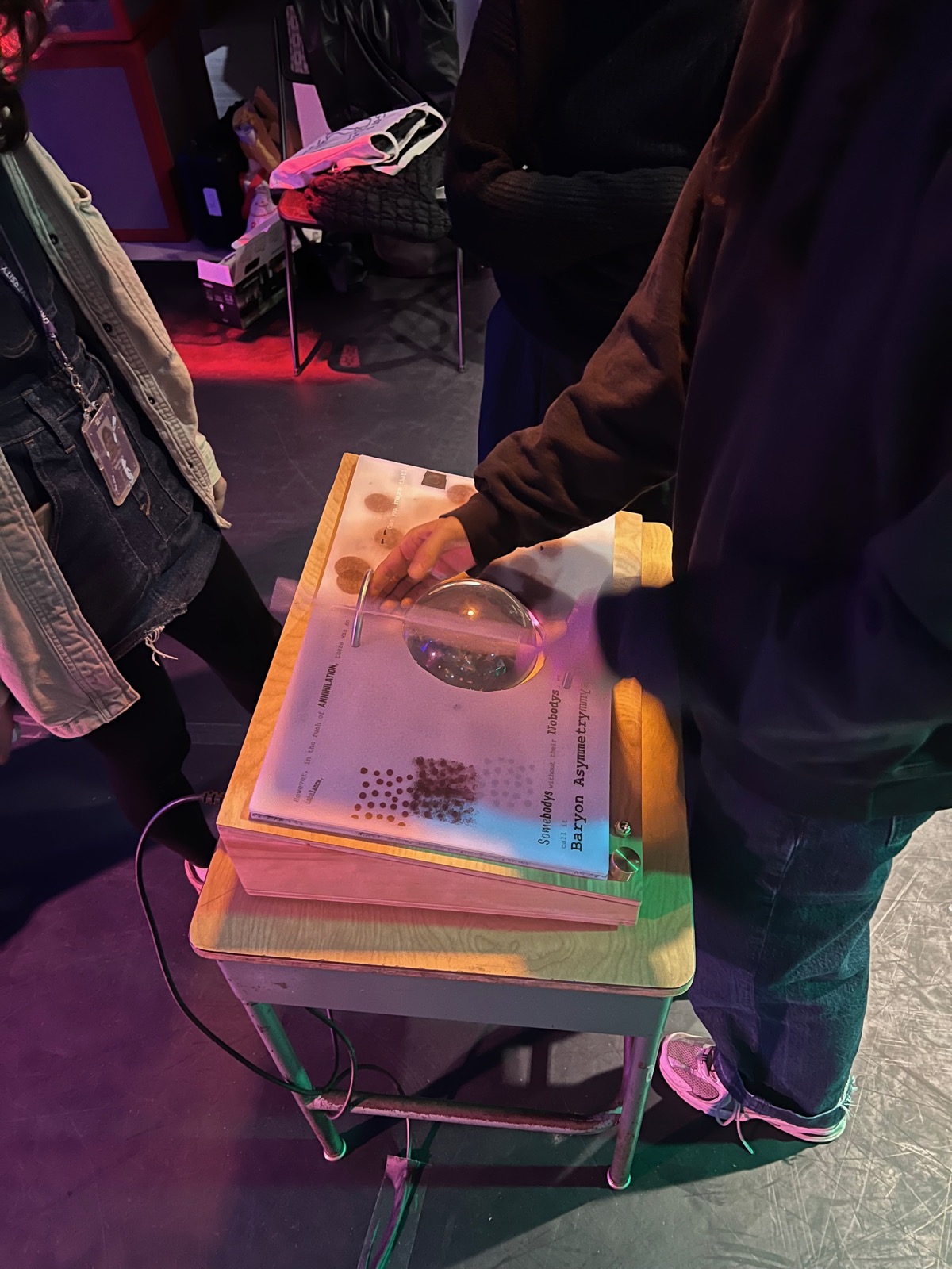
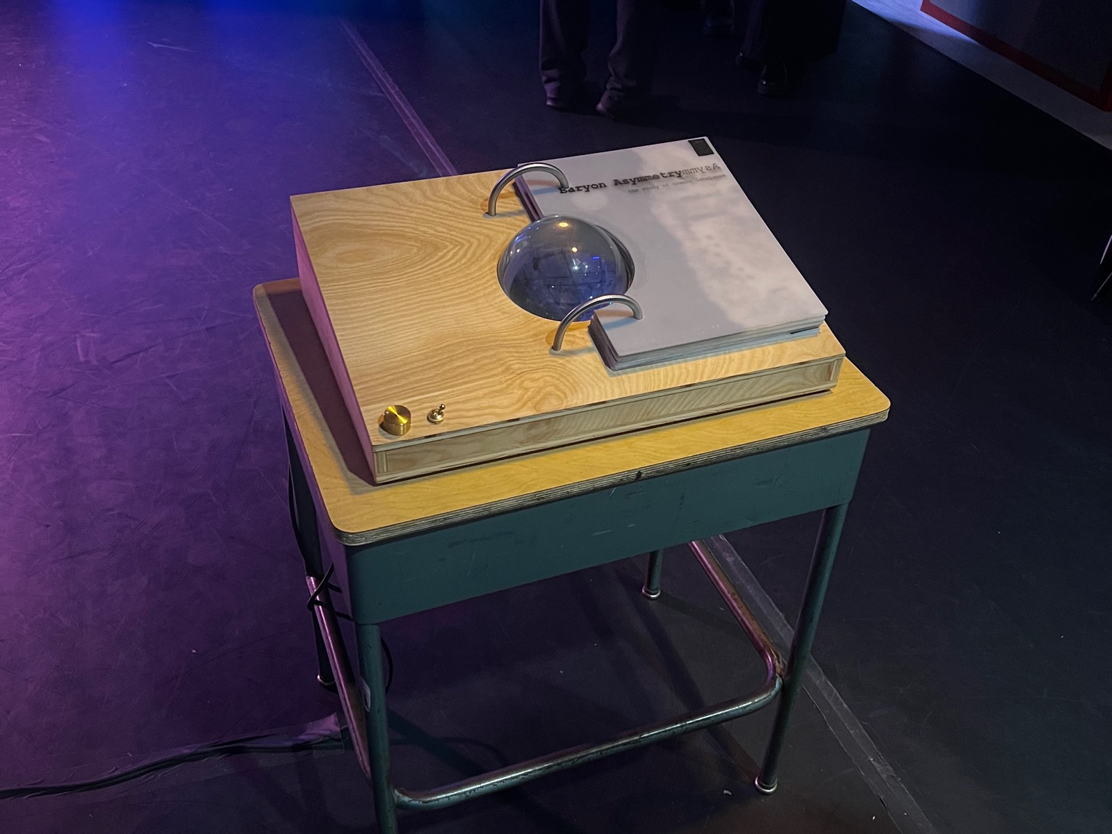
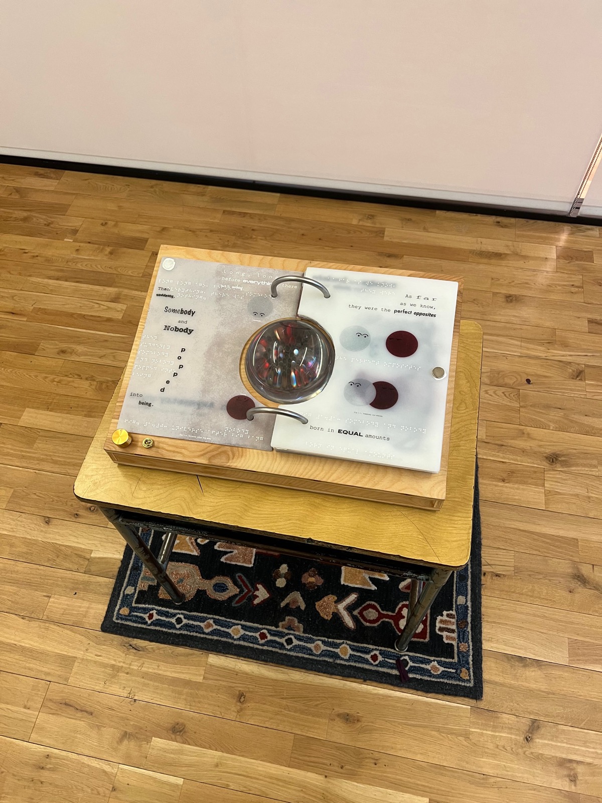
Finally, we installed it in the ITP spring show! A last touch was the inclusion of a small rug to frame the display and a label for our narration enabling switch. The final project had a disability focus with the inclusion of braille and textured graphics. Making the piece disability accessible was a quest that ran through the whole project. Alanna has mentioned how easy it is to add braille with the UV printer, turns out, it wasnt. That being said, given that it was a science museum piece, we wanted to ensure that it was accessible to all visitors — in the end, we only got braille and textured graphics for the first spread. Including a switch to enable narration was a gesture in the same direction.
The video below shows a demonstration of the interaction as the pages turn.